Tag Archives: Technology Trends

Where Do You Read?

Reading. Flickr Alui0000

Reading. photo from Flickr Alui0000

Where do you read most often?  Is it online?  Is it curled up with a paperback book?  Is it sitting at table, highlighter in hand, with a large and heavy tome laid out in front of you, or is it with your arms extended and newsprint held aloft? I’ve been thinking a lot lately about where and how we read. How does that impact our comprehension? What methods do we use to help us focus and retain what we read? What can we do to become better, deeper readers?  And what innovations do our new tools make possible that are not possible with the printed page?

It was MaryAnne Wolfe and her amazing book, Proust and the Squid, that really got me thinking about reading online versus reading on a printed page. A recent New Yorker blog post, by Maria Konikova, provides a very nice summary of Wolfe’s work.  In it she quotes Wolfe as she muses about the past and future of reading:

“Reading is a bridge to thought,” she says. “And it’s that process that I think is the real endangered aspect of reading. In the young, what happens to the formation of the complete reading circuitry? Will it be short-circuited and have less time to develop the deep-reading processes? And in already developed readers like you and me, will those processes atrophy?”

My conversations with educators and other education stake-holders frequently puts me in touch with people who are very concerned about the impact of too much time staring at screens, by the perceived demise of books, and by the apparent lack of reading focus seen in children raised on screens and e-readers.

But what scientific evidence do we have about the impact of the medium (printed page vs. screen) on our reading?  Turns out, there’s quite a bit. But the questions are by no means settled. Prior to 1992, most studies concluded that people read slower, less comprehensively, and with less retention on screens than on paper. But starting in the early 90’s reading studies have produced more inconsistent results.  Part of the challenge comes in what questions are asked, what is measured, and what confounding factors are taken into account. For example, are we primarily concerned with reading speed? comprehension? fatigue? accuracy? motivation? More over, what methods are used to assess those factors – eye movements?  manipulation?  navigation? reading strategies? assessments?

The terrain of a printed book.

The terrain of a printed book.

There certainly is a navigational dimension to reading. Wolfe points out that we are not born with the wiring to read. Our brains must learn to read, to process letters as physical objects. In many ways, you can think of reading a book as navigating a physical landscape. We create mental maps of the books we read – how far am I from the beginning, how distant the end? The two pages of a printed book are spread before me, like two large rooms to explore top to bottom, left to right. And the physical turning of the pages- swoosh- feels like proceeding along a path, marking my progress with a rhythm as I proceed.  There are far fewer of these physical landmarks with screen text. It’s a bit like spelunking in a cave – where am I, in relationship to the whole story? And how can I find my way back to this spot, right here? It is more difficult to see one passage in the context of the whole. I often remember events in a narrative by their physical location on the page – that crucial passage about the murder weapon was in the lower left hand corner, in the earlier chapters….One of the researchers in this area, Anne Mangen, Stavenger University in Norway, supports this point in her research about the physicality of reading. She’s found in her studies that while Kindle and print readers score similarly on most measures, the Kindle readers score comparatively worse than print readers on plot reconstruction – that is placing events from the story in the correct order. Mangen suggests that the haptic feel of a Kindle or a tablet does not provide the same support for mental reconstruction of what we read as does a print book.

And what about distraction?  Some researchers point to the hard-to avoid lure of a new tab, a link, or worse – a flickering advertisement off to the side.  Certainly, when reading online there are many, many opportunities to wander – some might say explore?  Regardless of how you think of it, once you depart you have leapt away from the initial task of reading.

A NYT graphic story on a reef in the South China Sea.

A NYT graphic story on a reef in the South China Sea.

Having said all of that, there are some remarkably interesting experiments with online reading that deserve exploration and consideration. For example…the graphic articles pioneered by the New York Times that marry video, stunning images, and text [this one about an avalanche at Tunnel Creek or this one on speed skating at the Olympics].  In these beautiful online reading experiences you are in the driver’s seat with videos launching just as you arrive, photos coming into full brightness as you arrive, fading as you flick or scroll away. Or how about the literature map that helps a reader make connections between authors and their works, or Robin Sloan’s tap essay for the iPhone, or this instructional offering on the dangers of fracking, or the gobsmacking Scale of the Universe?  And then there are annotation tools, like Diigo, Kaziena, and A.nnotate, and Evernote, that facilitate note taking, curating, and collaborative reading online. Researchers like Chih-Meng Chen are finding improved reading performance in children with collaborative annotation environments.

Another facet to consider here is the skills needed to read in these different environments. We are all very well-trained in how to read printed pages.  Pages numbers, tables of contents, the glossary and index nestled at the back – these are all familiar devices for us. What’s more, printed works are quite standard. The skills acquired when we are 5 or 6 years old serve us well as we move from early readers, to young adult, to the classics. We know what to do when presented with a print book.

Variations on e-reader navigation.

Variations on e-reader navigation.

By contrast, reading on the screen varies with the device.  How to size it, how to advance the page (a mouse, a track pad, a next button, a scroll bar) – a range of interfaces and systems to master. The innovative tool sets that various electronic reading devices have devised to mimic the manual manipulation of a book (highlighting, turning down a page, etc) vary widely as well. Each time you work with a new tablet or read using a different interface, you must learn how to use the tool d’jour. Perhaps we are so stuck in our print approach that this all feels mystifying to us, but it would not to someone who learned to read with these tools? Does this suggests a new way of approaching reading education? A new set of skills? If early readers learn to read with the tools, approaches, and navigational methods of reading on the screen will it be as comfortable for them as the printed page is for us now?

What do you think?  And how do you read most often?  I’ve been taking an informal poll among friends and family but would like to cast my net wider.  Take a moment, would you, to answer seven brief questions in this online survey about how you read? I’ll post the results gathered so you can see what comes of it.

With all this noodling, it feels natural to come to the conclusion that we need both. Print books to give us physical representations to collect, explore, and savor along with screen reading and its many promising adventures. But I don’t know. You tell me. You can take the survey right here or travel to it.


“Let us read and let us dance; these two amusements will never do any harm to the world!”  – Voltaire

2 Comments

Filed under Learning

Correlation: Tats and Twitter?

Where else can you find this kind of humor but at the NABT?

Where else can you find biology jokes like this, I ask ya?

Ten years attendance at the same annual conference gives one helpful perspective for measuring trends.  Last week I had just such an opportunity to measure the impact of social media on a conference community. The National Association of Biology Teachers conference (NABT) is an annual conference of high school and college biology teachers. It’s a smallish meeting – roughly 800 people – who gather to participate in posters, sessions, and workshops. “Teaching and Learning” is the mission and a fierce dedication to their students is the common bond. It’s a wonderful group and I always enjoy being in their company.

Although networking is a strongly stated goal of the assemblage, I’ve been struck by the lack of social media use amongst this community. There is a robust online community of AP Biology teachers (facilitated by the College Board) who regularly share updates, questions, and suggestions – but that’s just one small segment using just one (relatively blunt) tool. In past years, there have been attempts to inject a little social media sauce to the proceedings but they were tepid and never quite took.  A few hardy Twitterers, one or two ardent bloggers capturing the essence, but in past years it sounded like crickets out there to my lonely twittering posts.

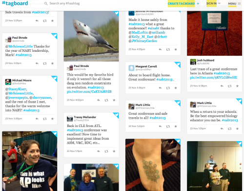
This year, however, was different. A vibrantly hard working Twitter crowd seemed to emerge out of nowhere, documenting the scene and tweeting the sessions.  Hashtags abounded.  Blog posts were thoughtful. Someone started an open Google Doc for posting notes from the session.  An NABT tagboard surfaced to showcase the Twitter productivity.

NABT13 Tagboard

Not only did the Twitter stream bring me in contact with many new teachers, it was an extremely useful way to make sure I was covering the right sessions.  You know how that goes at these conferences – so many good sessions occupy the same time slots – how best to decide which is the best fit for you?  What I quickly learned to do was pick from the program description then, once there, monitor the twitter stream to hear what was happening in the other sessions.  If the reports showed a session with a better fit for my needs, I would politely shift locations. If there were multiple best-fit sessions at the same time, I could always go to the Google doc page to pick up the notes from a fellow traveler.  It was a handy ways to graze and make sure to capture the bounty.

So what made the difference this year?  How did we move from the social media desert to this rich harvest of interaction and sharing?  I definitely noticed a greater number of younger members in attendance….hmmm.  I hate to make the ageist mistake. Was it my imagination or were there more attendees sporting tattoos (thank, Ilona – @mikoartscience – for pointing this out. Even from a distance you are remarkably perceptive!)?  Is there a correlation between Twitter-use and Tattoo-display? Mostly, I suspect it was a classic Malcom-Gladwell-esque tipping point: enough experienced Twitter users to lead by example and provide sufficient value so that less experienced others found it worth the effort.

3 Comments

Filed under Technology Trends

Dashboards for Connecting Workers

“The team members are all in different time zones, too many fall off the email trail, everyone complains about not being able to find the resource they need when they need it….there’s got to be a better way to get organized and communicate more efficiently.”

How many times have you heard a similar plea? We work with a number of business and research groups who seek the best, most efficient methods to connect their far-flung workers and keep everyone in the loop on communication, documents, updates, schedules, and project plans. Geographically dispersed teams and work-from-home members intensify the need for workable solutions.

A familiar dashboard.

Recently, we’ve had success crafting customized “dashboards”.  These are online hubs (for example Netvibes, My Yahoo, or iGoogle) that can be tricked out and populated with customizable widgets that display information pertinent to the team.  The idea is to integrate information from multiple sources into one comprehensive, easy-to-access and monitor display, resembling an automobile dashboard.  The information can be piped in from a wide variety of sources – e.g. updates from online calendars, microblogging streams, email, and  RSS feeds from news sources, journals, or blogs.  The widgets can also be programmed to serve as access points to other locations on the web – an online document storage system for instance.  So, in this way, even online locations that can’t actually be piped to the dashboard can be represented by a widget “doorway” – just click and travel there.

The “hub” platforms listed above all offer a similar business plan.  The basic service is free, premium service comes with a monthly fee.  So far, all of our needs have been met with the free versions.  The premium service gets you extra technical support, additional curation and analytical features.

So what do these dashboards look like?  Here’s a screen shot of a Netvibes dashboard that I set up for my personal use.

My personal netvibes hub.

As you can see, there are a number of “windows” (or, continuing with the auto dashboard analogy, you can think of them as dial readouts). Each window displays a dedicated stream of information.  Every time I reload the page, the windows refresh with the latest information from their original source.

This one-stop shopping approach saves workers’ time and frustration since all needed information is in one handy, private (password protected) place. The privacy is important – if this is a business group, they will want to protect proprietary information.

Perhaps the best way to illustrate how dashboards can work is to give a specific example.  We work with a group of medical researchers – a loosely knit team of 50 individuals and sub-groups, spread all over the United States, who meet mostly by phone and rely heavily on email. Keeping track of their collaborative work, their shared documents, and their topical correspondence is a source of tremendous frustration.  We started with an evaluation of their needs and concerns.  From there, we crafted the dashboard you see below (this isn’t their actual dashboard, for privacy reasons, but a mock-up to look like theirs).  The first thing to notice are the tabs across the top.  With an endless number of tabs you can subdivide your dashboard into compartments (by team, by function, or required objects).  I’ve circled in black the tabs on this dashboard below:  “Home”, “Communication”, “Documents”, “Library” and “Executive Committee”.

Mocked-up dashboard, showing the organizational tabs.

In this view, we’re on the “Home” tab.  This is a good place to put general stuff, welcome messages and orientation material. You can also see a Google calendar (project meeting dates and schedule), a to do list, and some Flickr images.  To make it more personal, you can include a short talking-head video of your community manager (using Eyejot), to welcome everyone to the dashboard and give them a dashboard tour by directionally pointing. Note that we customized the dashboard header with an image specific to their work, which could instead be a company logo or an identifying color.

Here are successive screen shots and descriptions of each tab, working from left to right:

Communications Tab

Communications tab. there is a window for a Yammer stream, one for your Twitter stream, or one for email.  Each person using the dashboard signs into their account to view it in the widget window.  For this project, we created a private Yammer group for the team members.  Their Yammer stream displays in its window and posts, replies, and updates can be made from there without traveling to Yammer.

Documents tab.

Documents tab. Here we’ve placed widgets for Google docs, box.net, and Egnyte; a range of online document creation and storage sites. This particular group prefers to use Egnyte.  We set up the widget so that they can log in, within the Egnyte widget, and download, upload, or view documents from within the dashboard.  If viewing or working within the widget window is awkward they can click on the widget’s top bar and a new browser window, displaying the Egnyte site, will open.

Library tab.

Library tab.  As the name implies, this is the place to display RSS feeds from journals, online news sources, or relevant blogs.  All required reading in one, handy spot. The final tab, for the Executive Committee, features a window to a wiki site for posting meeting agendas and minutes and collaborating on documents.

So, that’s the idea. Clustered access, easy to retrieve information, curation, communciation and collaboration. But what are the drawbacks? Even before they settled in to using this dashboard, our team of researchers expressed the following concerns:

  • We already have a project management tool, why do we need another one?
  • Is it too complicated?  Too difficult to learn?
  • What about security?  Will our information be protected?
  • Will my corporate or university firewall let me in?

We worked through their concerns step by step. Because we’d planned carefully, we were able to roll out a populated dashboard to the group with useful items on view that they recognized (a video with someone they knew, the Egnyte interface, etc). We provided orientation sessions in a series of brief webinars,  focused on just one function per training session. Participants observed (in a shared screen environment) and asked questions as the trainer walked through dashboard tabs and demonstrated how each function operates. Following each training, participants were assigned three brief homework tasks: all things they needed to do which are easier to do from the dashboard.

Subsequent trainings featured other functions. Yammer, wiki use, blogging, document curation, and metatagging followed. Once the group started to use Yammer, the penny dropped. They could see the value in the tagging and they could begin to see the dashboard advantages.

It’s not perfect. One member institution’s firewall blocked Netvibes and we had to make special arrangements.Yes, they do have other project management software, but none that weave together the communication and RSS feed functions with the other, more typical project management features.  Some participants are still not on board, but they are beginning to feel the tug of the larger group when the phrase, “it’s on the dashboard!” is used multiple times in a status meeting.

4 Comments

Filed under Tools

Experimenting with Participatory Media: Mike Gaines at University of Miami

Mike Gaines teaches general biology to undergraduates at University of Miami. He’s one of those incredible educators who is always trying something new – regularly reinventing his course and his approach in order to keep it fresh, alive, and interesting (for his students and for him!).

Mike Gaines' wiki page

Mike Gaines' wiki page

Recently he decided to introduce participatory media to his course (BIL 150).  For some time he’d been looking for a good way to turn a critical analysis of science in the movies into a workable course assignment and a wiki site seemed like a good way to organize it. He built a course wiki site, using Wikispaces, and gave his freshmen biology students the assignment to watch two movies, Contagion and 50/50, and then post their analysis of the biology in those movies (misconceptions?  inaccuracies?  controversies?)  as wiki entries. The student posts are very revealing. You can almost hear their wheels turning as they apply the course concepts (cell division, genetic mutations, viruses) to the science plot twists of the movie (cancer treatment, infection, and disease management).

Following success with that, he started a new page on the wiki site where students would record their observations and reactions to the Richard Dawkins lecture, The Magic of Reality.

Now he was up and running, he decided to experiment further.  Twitter, Wordle and Pixton quickly came next.  He used Twitter to keep in touch with his students, conducting virtual office hours to answer questions and take the “pulse” of the course. After each exam, he asked students to create Wordles (word maps) of their reactions to the exam so that the students could easily (at a glance) check in with each other on their sense of it (really hard?  how’d you do? what concepts were confusing?  how much and how did you study?) and how their own reactions compared to those of their peers. I thought this was a particularly ingenious use of a simple media tool. It was so interesting to read their potent relief as their calibrated themselves to their peers on terms other than test scores.

What I think Mike has done particularly well here is to design his teaching approach so that he’s engaged his students in an authentic experience, where the representation of his students’ knowledge is absolutely essential to the ongoing flow of the course.  There is no busy work here, no tack-ons – everything the students are doing feels important and part of the fabric of the course.

Cleverly, Mikes also used that course wiki site to get final feedback on the course from his students. He set up a new wiki page for student feedback and asked them all to post their comments, suggestions, gripes, and concerns on that page.  From the looks of it, almost all of his students posted something and many of them wrote a quite detailed and useful analysis of their experience.  There are some excellent insights there, but if you don’t have time to read them all, here are a few of my favorite student remarks:

“Because our audience was middle schoolers, critical thinking was required to help express technological and biological in an understandable manner to a general audience.”

“I enjoyed having the opportunity to provide my own input (through Twitter especially) because it gave me a chance to actually think about things more thoroughly. For example, by simply asking us to tweet you about what we found most hard about the test, you are asking us to rethink the test and try to figure out what went wrong. Tweeting is such an easy way to provide input but it really helps spark thinking.”

“Throughout this course twitter has been used as a useful tool to communicate with the professor. Although it may seem informal, it is an effective means of communication because a student can ask the professor a question as soon as they think of it. The comments from twitter were then converted to Wordles, this was exciting because as a student I got to see that other students had the similar concerns and comments on the course.”

“In particular, I thought the use of twitter was a fantastic way to connect with Dr. Gaines and make you stand out in a large class. The same goes for the Wordles, which allowed you to have some valuable input on the tests. It really showed that Dr. Gaines cared about us as students, and didn’t view us all as just one gigantic class that blended together.”

Pretty darned impressive.

And here’s what Mike, himself, had to say about the experience,

“My advice to teachers who want to try this is that once you become familiar with different aspects of Web 2.0 technology, it will be a useful addition to your pedagogical tool kit. It’s how todays students communicate. I had some fears at first because I felt my students were “digital natives” while I was a “digital immigrant” and I would know less than they do.  But this did not turn out to be the case. This teacher and his students became partners sharing their different expertise in the digital world to make my large lecture class more interactive and exciting.  So go for it!”

2 Comments

Filed under Reflections on Teaching, Teaching with Technology

Storytelling

Storytelling

Humans are storytelling creatures. Whenever someone says, “that reminds me of a story…”  we prick up our ears and settle in to listen. Two recent Scientific American articles, The Secrets of Storytelling and Fiction Hones Social Skills shed new light on the intricacies and importance of storytelling.  The first article, by Jeremy Hsu on the secrets of storytelling, hones in on why our human brains seem to be particularly well wired for both telling and hearing stories.

The impact of storytelling

The second article dispels the myth that avid readers are isolated bookworms, out of touch with their social world.  The article’s author argues that we humans use stories as a kind of social simulation to help better understand ourselves and human character in general. That entering these imagined worlds of fiction help us to develop empathy and rehearse social interactions so that we are better fixed to take on another person’s point of view.  The article’s author cited a 2006 experiment conducted by Raymond Mar (University of Toronto).  Mar and his colleagues assessed the reading habits of 94 adults and tested their sample on emotion perception and social cognition (by asking them to make judgments/decisions on emotional state/interactions through photographs or video clips).  What they found was a positive correlation between reading fiction and the ability to correctly assess emotional states and interpret social cues.  In other words, the more fiction someone read, the stronger their social aptitude. This is an opinion I’ve long-held (perhaps rationalizing my love of fiction) but it was so gratifying to see it described so well, and  backed by scientific evidence, in a peer-reviewed journal.

Like many others, I’ve been transfixed by National Public Radio’s Story Corps project.  Since 2003, the non-profit Story Corps has recorded over 35,000 stories of people’s lives. These digitally recorded oral histories are broadcast weekly on NPR and archived at the American Folklife Center in the Library of Congress. The heart of the Story Corps project is the interview. Typically, the storyteller is interviewed by a friend or loved one, urged on to recount a story familiar to both of them. In addition to the warm humanity that comes through in these stories, I’m always struck by the interplay between the interviewer and the storyteller – the nature of the questions, the good-natured coaxing, and the way that rapt listening works to loosen the storyteller’s tongue.

So what is it that makes a good story?  Ira Glass, from This American Life (another fabulous storytelling radio show from National Public Radio), in his video series on storytelling, outlines the building blocks of good storytelling. First, he explains, there is the anecdote – a sequence of actions, one thing following another.  The power of the anecdote is so great that, no matter how boring the facts, you still tune in because it is a sequence of events, like breadcrumbs, that you are eager to follow in order to get to the implied and hoped-for destination.  What’s going to happen? He goes on to say that good stories include bait. The bait typically comes in the form of a question that your story is shaped to answer. And then there’s the all-important point of the story – the moment of reflection, the insight, the ah-ha moment that brings your story together and makes it all worthwhile.  Similarly, Brian Sturm, UNC Chapel Hill, explains his view of storytelling, theory and practice in this video. He explains what a story is and how good stories weave together character, plot, and events as a unified whole and why they are so persuasive (he also tells some great stories in the bargain).

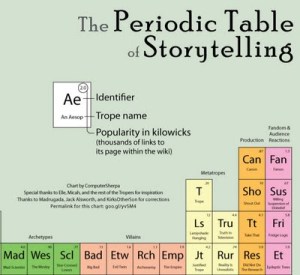
In thinking about storytelling, I found this visual resource helpful  – The Periodic Table of Storytelling. It provides a useful organizational framework  (familiar to any graduate of a general chemistry course) through the different tropes, genres and storytelling methods in a handy, navigable chart.

The periodic table of storytelling

“Digital storytelling” has become an educational buzz phrase as educators and administrators attempt to use participatory media tools so that students can tell their stories more effectively to a wider audience.  There are some amazing online resources to help any educator bring digital storytelling methods to their students.  If you haven’t already seen it the Center for Digital Storytelling (based in Berkeley, CA – natch) is an amazing online resource. Penguin books sponsors a wonderful called we tell stories.  Contests abound, like KQED’s Digital Storytelling Initiative. The University of Houston has a wonderful web site designed to support the educational uses of digital storytelling.  The National Storytelling network, a sort of guild for storytellers, has an interesting website chock-full of resources. And there is even an international conference on digital storytelling, slated for March 2012 in Valencia, Spain.  There’s a range of useful storytelling tools available online like VoiceThread, Pixton, Voki, Storify, and Tikatok – to name just a few.  The always amazing Alan Levine (aka CogDog)’s wiki site on “50 Ways to Tell a Story” is a terrific resource where he tells the same story using 50 different online tools so that you can figure out the unique affordances of each one.  With free and easy-to-use storytelling tools and video, we can all be published authors.

Then there is the notion of transmedia storytelling – the fine art of telling a story via a range of media types (print, audio, video, etc).  The idea is to craft your story in such a way so that it has built-in mobility, so that you harness the power of various media to augment, so that you tell parts in one way, embellish other parts in a different way.  Here is a PFSK series on The Future of Transmedia Storytelling that gives food for thought.

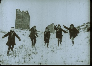
A Child's Christmas in Wales

This Christmas, as a family, we gathered together on Christmas Eve, as we do every year, to read aloud to each other Dylan Thomas’s Child’s Christmas in Wales.

“All the Christmases roll down toward the two-tongued sea, like a cold and headlong moon bundling down the sky that was our street; and they stop at the rim of the ice-edged fish-freezing waves, and I plunge my hands in the snow and bring out whatever I can find. In goes my hand into that wool-white bell-tongued ball of holidays resting at the rim of the carol-singing sea, and out come Mrs. Prothero and the firemen.”

As it always does, that story wraps us in the warm glow of Christmas’s remembered bringing the snows, the guttering gas flames, the swelling uncles, and tipsy aunts to life – even though they were written about an age ago, in a place far far away.  Over dinner the next day, I urged my parents to tell stories from their youth to my listening sons. I could feel the story of my mother’s high school Latin teacher and my father’s first job as the operator of copier for architectural plans sinking into the fiber of my two sons’ young souls. Lodging there, expanding their perspective, and adding to the texture of what they will become.

11 Comments

Filed under Reflections, Teaching with Technology

Connecting the Dots: Billy Beane, Nate Berkus, and Neil Selwyn

What do Billy Beane, Nate Berkus and Neil Selwyn have in common?  Other than the fact that they are roughly the same aged, succesful white men, I know that it seems like an unlikely trio.  But let me try to take them one by one and connect the dots, as I seen them…

Billy Beane

First, Billy Beane, the general manager of the Oakland A’s baseball team.  Beane is well know in baseball circles for his data mining and in-depth analysis of baseball’s volumes of statistical information in order to gain a competitive advantage as he built his team.  He is more generally famous these days for being played by Brad Pitt in the newly released movie, Moneyball, based on the book of the same title written by Michael Lewis.

In the book, Lewis recounts spending the 2002 baseball season following Beane, the players, and the game as he gained a deep appreciation for this method.  Paying attention to statistics, of course, is not new to baseball – GMs, talent scouts, coaches, and fans have done this for time immemorial.  What was different about Beane’s approach was his willingness to rethink baseball, how the game is played, and who is best suited to which position.  He searched for inefficiencies in the game and for the story behind the statistics.  For example, rather than tracking hits, he looked at on-base percentages.  He also looked at mitigating factors involved with the various collected statistics (the weather, action leading up to errors, what else was happening on the field).  This more nuanced scrutiny put Beane in the position of being able to see raw potential in a player that others, looking at more conventional statistics, might have missed.  As a result, players who were seen as washed up or underperforming could be picked up for less money and, in the right circumstances, be allowed to shine.  For example a weak shortstop, with the right ingredients, and under the right set of circumstances, might wind up being a terrific pitcher.

I drew an instant line of sight between Beane’s unusual way of looking at data and education.  Isn’t that precisely what we should be doing with assessment?  And I think there are some valuable lessons in Beane’s approach for educators, for instance, his unflagging sense of the game as a whole.  While Beane burrows deep for facts and figures, he doesn’t fall into the trap of reductionist thinking but, rather, keeps the entire game and all of its interlocking parts in his mind’s eye. As Lewis puts it, for Beane, “the probability of any one thing happening in a baseball game is influenced by everything else that happens.”  Nice. Like a baseball game, what happens in a classroom is infinitely complicated and measuring the “outcome” of any one student (high stakes assessment) doesn’t tell you all that much (nor does it come close to what you need to know) about the potential for that student, or the teacher, or the classroom itself.  Beane attempted to make his approach to the game of baseball more scientific as he tried new and different measures to assess what was going on in the game.  Ultimately, he (and others who now use his methods) came to realize that there is a certain amount of “gut instinct” at work here as well; that it’s all extremely complicated, with many, many moving parts, and in order to really understand what is at work you must look at the detailed data AND the whole picture.  Yeah.  Sounds familiar.

Nate Berkus

Second, Nate Berkus.  I know, it’s a leap, but bear with me.  For those of you who don’t watch daytime television, Nate Berkus is a design professional.  He entered the television scene as a consultant, sometimes brought on air by Oprah Winfrey.  He worked his magic with re-imagining small spaces, bringing order to clutter, and sharing his design insights and eventually earned his own show, which airs weekday mornings at 10:00 a.m.  I first became aware of Berkus through a gut-wrenching tragedy in his life.  He happened to be vacationing in Sri Lanka, with his partner, when the 2004 tsunami hit.  Somehow, Nate survived, but his partner did not.  That heart-wrenching story was enough to compel me to watch his show, which I’ve now seen a few times.  While my motivation for finding the show in the first place was to gain some insight into how someone survives a tragedy of that proportion, my motivation for returning to it more than once was a fascination over what he was able to accomplish, design-wise, with very little money and a little elbow grease.  And here’s the thing – all of the home or apartment “make-overs” featured on his show involve him.  Nate is always there – with his sleeves rolled up, ripping off plaster, hanging shelves, stapling fabric, and hanging pictures.  Sure, he has a team of worker bees and he directs their efforts, but you always see him doing the work.  My guess is that it’s the doing the work that’s given him this gift of seeing possibilities.

Neil Selwyn

And that leads me to Neil Selwyn. I know, it’s been a long path, and you’ve been very patient.  Neil Selwyn is a British sociologist who writes beautifully and intriguingly about the integration of digital media with everyday life. I’ve just come across Selwyn’s essay (first published in the Europa World of Learning, 2012) entitled Social Media in Higher Education.

In this essay, Selwyn takes a look at the challenge that social media tools and applications present to higher education.  He examines social media and new types of learners, as well as new types of learning, and takes a deep look at the way higher education is responding (or not) to these influences.  I appreciated his even-handed and thoughtful description of the challenges – Selwyn’s training as a sociologist really shines – he carefully considers all the facts and issues in an objective manner. For example, Selwyn points out that internet access is not as ubiquitous as we’d like to think and that digital inequities persist along race, class, and gender, age, and geographical lines, making clear that social media use is not the equitable and democratic activity that it is often portrayed to be.  What’s more, students’ preferences for particular tools vary within economic and social classes, as well as ethnic boundaries.  Selwyn is also bald about the fact that social media use by many falls far short of the participatory and interactive potential and all too frequently falls down on the side of passive posting – or worse, carping from the sidelines. But even with the disparity between educational rhetoric and educational reality in mind, Selwyn still winds up on the optimistic side.

Particularly compelling to me was his call for a new “pedagogy 2.0″ as in this passage here:

“Nevertheless, many higher educators believe that universities are capable of accommodating (and benefiting from) these shifts in emphases. Some commentators have therefore begun to talk of the need to develop a ‘pedagogy 2.0’—i.e. innovative pedagogies that leverage these affordances to support learner choice and autonomy.”

He states that there is “room for higher education community itself to assume a greater role in shaping the development of social media on the ground in higher education settings. After all, social media technology is something that is supposed to be created by its users—higher education institutions and educators included.”

So here’s what I take from considering the work of these three seemingly disparate people, as I think about the application of new media to education:

  • We need to keep trying new things and consider alternative (unusual) ways of examining what goes on in a learning experience.
  • It’s important to regularly assess the very measurements in use, to make sure they are still working and telling us what we need to know.
  • Data is good, particularly when it’s analyzed in relationship to the whole
  • We must engage with these new tools and applications ourselves (you can’t figure out how they will work best for learners unless we understand them from the point of view of a user)
  • We need to keep our heads – to look at the problems and challenges with clear and unflinching eyes, and listen carefully to the short-comings as we embrace the possibilities

Leave a comment

Filed under Reflections on Teaching

Chihuly: Through the Looking Glass at the MFA

Chihuly exhibit at Boston's Museum of Fine Arts

Today I visited the new Dale Chihuly exhibit at Boston’s Museum of Fine Arts.  It’s a breathtaking exhibit, thoughtfully staged in the basement of the museum’s new wing where the light can be carefully controlled.  For those unfamiliar with Chihuly’s work, he is an artist who works primarily with blown glass.  His breathtaking, large-scale glass sculptures can be found all over the world – in London’s Victoria and Albert Museum, in Canada, in just about every state in the U.S., and in the new Palm Hotel in Dubai.  A car accident that left him with vision in only one eye brought him to painting in order to instruct his students and collaborators on glass projects.  Now his drawings, lithographs, and paintings are quite popular as well.

The MFA installation is really breathtaking.  Huge structures, artfully curated for maximum reflection and impact.  My favorite was this wooden boat, overflowing with Chihuly glass baubles, set on a glass surface that reflects back their brilliant colors.  Equally interesting was a room full of glass sculptures inspired by Native American blankets and baskets.  Just how he forms glass into that floppy basket shape, I’ll never know.

Active participants.

But I have to say that the most intriguing part of the exhibit for me was watching the visitors, watching the exhibit.  We went on a Saturday, so the place was packed, and people were snapping photos all around me.  Cameras, iPhones, cell phones, video cams – the rooms reeled with the secondary light source of theri flashes, green viewfinder lighting, and the glow of LED screens.  It was really remarkable.  What’s going on here?  Of course, it might simply be because they could (unlike most art installations, in this one, camera flashes would not hurt the art objects and so photography was permitted).  But I think there’s more to it than that.  I have noticed a marked change in our perception of an art experience.  With these amazing technology tools, always within our reach, and the ease of sharing the products we create, we have morphed from “passive audience” to producer participants.  I would wager that those cell-phone-camera images will not just sit on their owner’s cell phones.  Rather, the visitors who took them will be printing, emailing, geo-locating, uploading, mashing, soda-snapping, twitpic-ing them with all of their friends and families.  And in the process of doing that, they are evaluating, comparing, synthesizing, reporting, and connecting.  “Which was your favorite?”  “How does this compare to the piece you saw in Dallas? ” “Get a load of that blue!!” “Could we try to make something like this?”  Who knows, maybe even a few of them are blogging about their experience – right now.

2 Comments

Filed under Technology Trends

Virtual Worlds on Demand

There has been so much going on with online virtual worlds these days, it seems there’s something new to read about, experience and evaluate everyday.  I can barely keep up with all the new, for-profit worlds that continue to sprout. But word of Kitely definitely caught my eye. Kitely is the new toy, running on the latest version of Open Sim, created by an Israeli start-up that just released their not-quite-ready-for-prime time beta product last week.

You start Kitely from their web site, where anyone with a Facebook account (they’re going for automatic set up based on existing identifies, smart move) can create and enter their own virtual world  – and then invite as many friends as they want by simply sharing a url.  So, I tried it.  On the Kitely site, I pressed the big, blue button that says “Log In With Facebook” and from there, “Create World”.  Kitely downloads a small plug-in that basically launches your Second Life viewer (or Imprudence, or whatever you have set to your default).  On a Mac, the log in was a bit tricky as the password is in the wrong field and must be painstakingly typed in the correct field – oh, and use Chrome or Firefox if you’re on a Mac – but, hey, it’s beta, I’m sure they’ll work this stuff out.

Anyway, once those hassles were dealt with — poof!  There I was.  Standing on my brand spankin’ new virtual world:  Heyden Island.

There I am, on my own, brand new, virtual world

Amazing.  These Kitely virtual worlds are created on the fly.  The whole thing runs on the Amazon cloud so new instances of Open Sim (and thus, new regions) are created as they are needed.  You can either create a new world or upload an OpenSim Archive (or OAR), created elsewhere, and make that your world. Once you’ve created a world and landed there as an avatar, any modifications you make to that avatar are kept as you enter anyone else’s world. That’s because all of the Kitely sims are on the same grid.  Unfortunately, you can not teleport from one region to another and hypergriding is not yet a part of the Kitely product, so you are limited to their grid.

Right now there is no money changing hands with this product, though the path to monetizing it is pretty clear.  The creators of Kitely say there will be no set up fees and visitors to any one’s world are not charged.  Instead, if you create a world, you use “points” (I got 50 points just for going through the set up process).  So, once the product is out of beta, they will set up a charge-for-use structure. And that seems like an excellent plan for people who just want a virtual world meeting place every now and then, and don’t want to pay the heavy overhead of renting/owning and maintaining land in Second Life or Open Sim.

So – more information?  You can follow Kitely on Twitter, read two very good fulsome write-ups by Marla Korolov on HyperGrid Business here and here, read about it in New World Notes, and follow along with the ToolsJammers as they explore Kitely.

Leave a comment

Filed under Technology Trends, Virtual Worlds

Machine Cinema

“What’s up guys?  My name’s Hutch and I make Call of Duty videos and I put ’em on the internet.”

That is the opening line to a series of extremely succesful game-play videos produced, filmed, and posted (on YouTube) by a guy named “Hutch” (he’s made over 200 of them).  Hutch is a prime example of an interesting video game spin-off culture.  These are avid, expert gamers who make screencasts of their own game play on such intensive first-person-shooter games as Halo, Call of Duty, Crysis, and MMORPGs (massively, multi-player online role-playing games) like World of Warcraft.  These videos are extremely well done and enjoy loyal followings, nearly hero status, really.  This example of Hutch’s work already has nearly half a million views. But my personal favorite is this one of Hutch and his mom – Debbie –  narrating the video together, with his mom chiming in and supporting him.  A classic.

I find this phenomenon fascinating. My high school-aged son tells me that, for him, it’s like televised sports – but better. When he watches these videos, he sees expert action in an arena familiar to him.  And, unlike a baseball fan watching a major league baseball player, my son might actually be able to attain the level of expertise evidenced in the screencast.  He learns from these videos – tips, techniques, strategies, approaches to the game – that he can then turn around and apply to his own gaming. According to the web site, machima.com, 40 million unique video gamers view over 350 million videos per month. This is a new major culture that’s spun off the video gaming industry.

What’s more the creators of these videos narrate their play. So as you’re watching the expert duck around corners, load their weapons, and make split-second decisions, they explain what they are doing – providing insight, humor, and revealing their secrets as they play.  It’s like having a faithful (and extremely hip) teacher right by your side, guiding and supporting your learning. Hmmm….what could we education types learn from this example?

2 Comments

Filed under Teaching with Technology, Technology Trends

Gardner Campbell’s Bag of Gold

Gardner Campbell, the Director of the Academy for Teaching and Learning at Baylor University (also Professor of Literature and Milton scholar), is a thought-leader, blogger, and frequent speaker on the topic of applying new media tools to teaching and learning. Every time I hear him speak, I am reinvigorated by the endless open-education possibilities.  I’ve come to see Gardner’s approach as a mission to remove blockades, open our minds, abolish fear and create on-ramps for creativity and new thinking.  He is a masterful teacher himself  –  on fire with the pure zeal that comes from being so intellectually stimulated by the steady diet of ideas and insights in which he delights.

Despite the objections and indifference he encounters with members of the academy, Gardner is an optomist (it’s his nature) and is always ready with a funny insight or humorous anecdote (typically rendered at his own expense) that helps us all keep the faith.  In this talk, No Digital Facelifts, from May 2010, Gardner tells a funny story in the first 2 minutes about trying to introduce faculty to the use of new media.  “It’s as if day after day, I say, ‘I have a bag of gold, would you like a bag of gold?’ and they say, ‘How do you have time for bags of gold?'”  It’s a perfect story that made me laff out loud when I heard it.  Because, like all effective humor, it cut right to the bone of the truth.  Yup.  That’s it.

As if to underscore the truth of that anecdote, Noise Professor posted this Xtranomral animation of the story.  And that inspired me to create this (with a bit of poetic license):

Thanks, Gardner.  For all that you do.

8 Comments

Filed under Reflections on Teaching, Teaching with Technology